
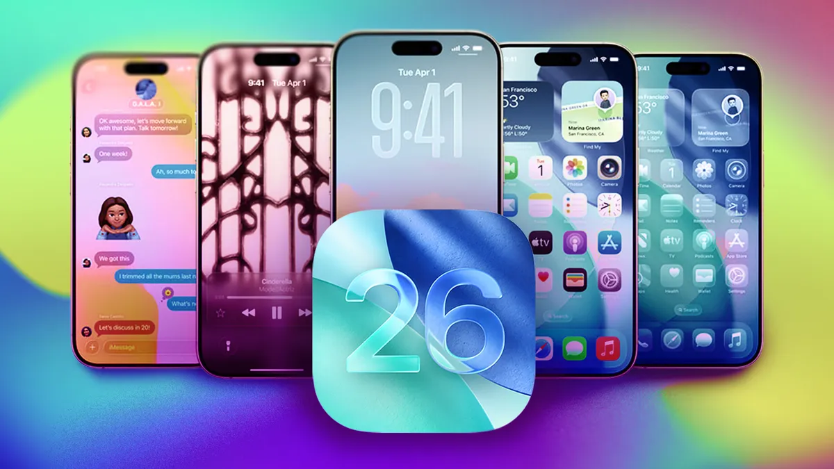
Apple is giving users a new way to control the visual style of its operating systems after months of feedback surrounding the company’s glossy “Liquid Glass” interface. The next update for iOS 26, iPadOS 26, and macOS 26 introduces a new appearance toggle that lets users tone down the heavy transparency effects and bring back a more solid, matte-like look.
A Response to Widespread Feedback
When Apple launched the Liquid Glass design earlier this year, it promised a “reimagined interface that captures the depth and realism of glass.” The new look made menus, notifications, and widgets appear to float above the screen with realistic light refraction. But while visually striking, it quickly drew criticism from users who found it distracting and difficult to read, especially in bright environments or over colorful wallpapers.
Many complained of reduced contrast and even eye strain. Designers and accessibility advocates also expressed concern that the design prioritized aesthetics over usability. Apple’s new “Tinted” mode aims to address those concerns without abandoning its modernized design language.
What’s Changing
In the upcoming update (version 26.1), users will find a new section under Display & Brightness on iPhones and iPads, or under Appearance on Macs. The new toggle offers two choices:
- Clear Mode: The original Liquid Glass style, with high transparency and reflections.
- Tinted Mode: A more opaque version that adds color shading to panels and menus, improving contrast and legibility.
The adjustment affects all major interface elements, including Control Center, Notification Center, widgets, and app overlays. Even third-party apps that use Apple’s default interface components will automatically follow the new appearance setting.
Why It Matters
Apple’s decision is a rare but telling shift in how it responds to design criticism. The company has historically been reluctant to backtrack on aesthetic decisions, but the volume of user complaints clearly prompted a rethink. The new Tinted option demonstrates that Apple is willing to give users more flexibility, especially when a design affects accessibility and comfort.
It also reflects a growing recognition that users engage with devices in varied lighting environments — from sunny outdoor use to dim nighttime reading — and need interfaces that adapt accordingly. The Liquid Glass look, while sleek on stage, wasn’t universally functional in everyday use.
No Middle Ground — Yet
For now, Apple’s update offers a simple binary choice: Clear or Tinted. Some users have already called for a slider that would allow fine-tuning of transparency levels, but Apple has not indicated whether such customization will arrive in the future.
Despite that, the addition of any toggle at all represents a meaningful step toward giving users more control over the visual experience — something Apple has traditionally limited to color themes and dark mode.
Design Philosophy Evolving
The Liquid Glass debate highlights an ongoing tension within Apple’s design philosophy: the balance between artistic innovation and practical clarity. While the company’s design team continues to push for realism and depth, the new Tinted option reasserts the importance of readability and comfort.
It’s also part of a broader trend toward personalization. From customizable lock screens to adaptive wallpapers and color accents, Apple has been gradually loosening its historically rigid approach to UI design. Allowing users to decide how transparent their operating system looks fits naturally into that direction.
A Win for Accessibility
Beyond aesthetics, this change is a victory for accessibility advocates. Transparent and reflective surfaces can create readability issues for users with low vision or light sensitivity. The more subdued Tinted look helps ensure system text and icons remain legible in all conditions.
By addressing those issues, Apple is not only refining its interface but also reinforcing its commitment to inclusive design principles — a growing area of focus across its hardware and software ecosystem.
Looking Ahead
The new feature is currently available in the developer beta of Apple’s operating systems and is expected to roll out to the public soon. As with previous design tweaks, Apple will likely monitor user feedback before finalizing the feature for all devices.
With the introduction of the Tinted option, Apple has effectively acknowledged that one size doesn’t fit all. The company’s latest move proves that even its most ambitious design innovations must evolve alongside the needs of the people who use them every day.


Leave a Reply