
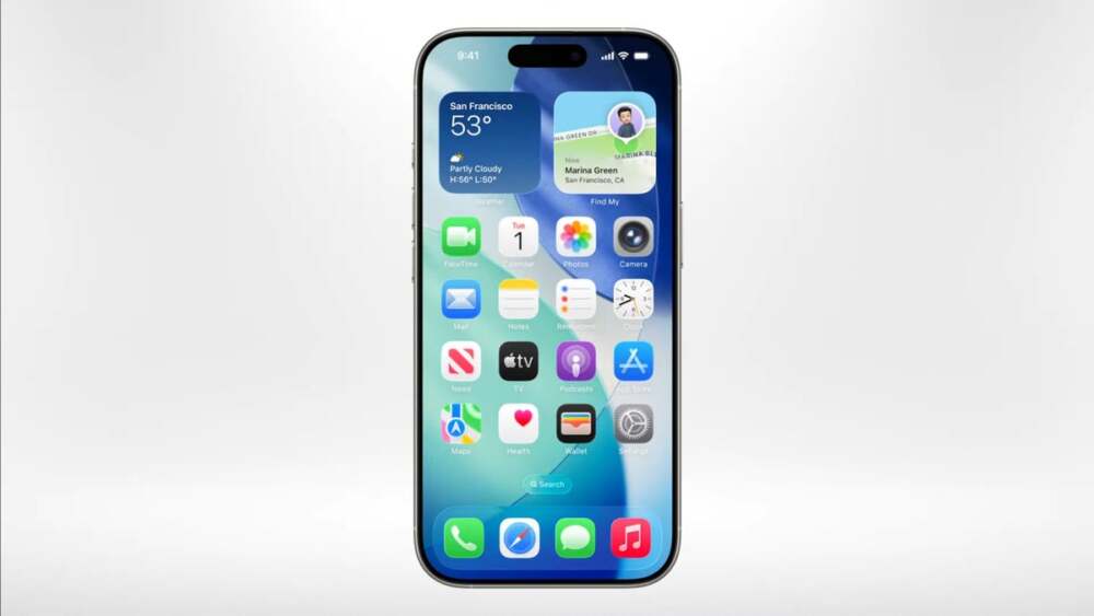
Apple’s iOS 26 update introduces a series of redesigned app icons, giving iPhones a modern and streamlined appearance. The update is part of Apple’s ongoing effort to refine its user interface and enhance the overall visual experience.
Highlights of the New Icon Designs
- Calendar: Now shows only the date, simplifying the icon’s layout.
- Camera: Updated to a minimalist lens-only design, reflecting current design trends.
- Clock: Features only the 3, 6, and 9 markers for a cleaner look.
- Mail: Redesigned with subtle modern adjustments to improve readability.
- Photos: Significantly revamped, making it appear very different from prior versions.
User Feedback
Reactions among iPhone users have been mixed. Some praise the sleeker, contemporary look, while others miss familiar details. For example, the new Photos icon has drawn criticism from users who feel it looks less clear at smaller sizes.
Conclusion
The iOS 26 icon refresh demonstrates Apple’s commitment to evolving the iPhone interface while balancing aesthetics with usability. These changes are expected to gradually roll out as users update their devices, giving everyone a chance to experience the updated visual style.


Leave a Reply