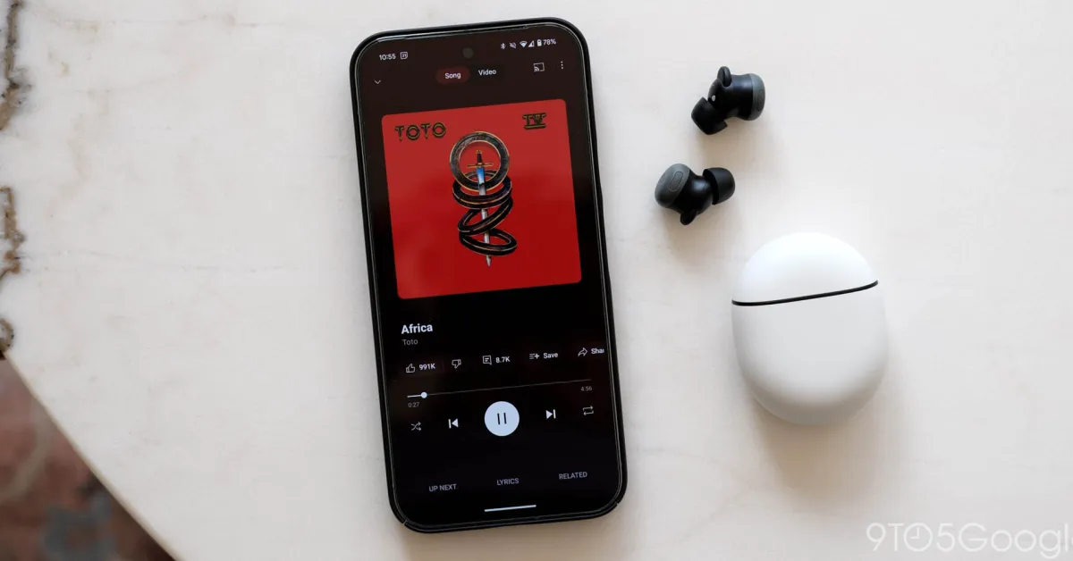
YouTube Music is testing a sleek redesign of its Now Playing screen that aims to make navigation cleaner and controls more accessible. The changes have been in development for months and are rolling out gradually to users across Android and iOS.
What’s New
- The update introduces a dual-pane layout, which splits the screen into two sections. One pane focuses on the media controls (play, pause, skip, etc.), while the other pane shows things like the queue, album art, and additional actions.
- The “thumbs up / thumbs down” buttons have been moved out of the action carousel and placed next to the song title and artist name in more prominent circular buttons. This helps the user quickly rate a track without having to swipe through other options.
- The design shifts some of the action buttons (like Share, Save, Download) and the song/video toggle into the carousel area, freeing up space near the top for cleaner display of the current track’s info.
- The timeline slider remains centered, but it has been made blockier and more visually prominent to better match YouTube Music’s other design elements.
- Additionally, the layout aims to facilitate one-handed use, which is especially helpful on large smartphones. Key actions that were buried are now more easily reachable.
Why It Matters
- These tweaks are part of YouTube Music’s broader user interface refresh of recent years. The platform is aiming for better usability, especially for people who frequently use the Now Playing screen or switch between media tasks.
- By making the thumbs up/down controls more accessible, the app enhances feedback loops between listeners and recommendations, which may improve personalization and satisfaction.
- A cleaner design also helps reduce clutter and cognitive load: fewer extra taps, less swiping, clearer visuals, which contributes to a smoother listening experience.
What’s Still in Flux
- Because it’s being tested via A/B experiments, many users report seeing different versions or missing pieces of the redesign. Some users have had the updated layout, others are waiting.
- Depending on device size and OS version, certain elements may look slightly different or be positioned in alternate spots.
- The rollout timeline isn’t officially confirmed for all countries or for all users. It will take time before everyone sees the changes.
Bottom line:
YouTube Music’s new Now Playing redesign brings a fresh, dual-pane layout with more intuitive placement of rating controls, cleaner visuals, and better one-hand usability. While still under testing, these changes show where the platform is headed: toward more streamlined, user-friendly media control.






Leave a Reply